
Monday, 9 May 2011

Thursday, 5 May 2011
Evaluation ‘How effective is the combination of your main task and ancillary text?’
Images:
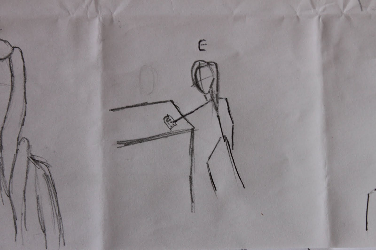
 We decided not to just use a screen capture from our trailer, although we did discuss it. So we took separate photo's specifically for the film poster. We created our poster using photoshop. We added a scribbled text in the background saying "I AM EMMA", in dark shades, to give a psychotic eary atmosphere.


SHOTLIST
TITLE
- Long profile shot
- Over the shoulder
- close up shot (2 girls)
TITLE
- Close up shot
- Point of view
- Long shot
TITLE
- Over the shoulder
- Profile shot
- extreme close up shot
- over the shoulder shot
- extreme close up
TITLE
- Over the shoulder
- close up shot (2 girls)
TITLE
- Close up shot
- Point of view
- Long shot
TITLE
- Over the shoulder
- Profile shot
- extreme close up shot
- over the shoulder shot
- extreme close up
TITLE
HOW DID YOU USE MEDIA TECHNOLOGIES IN THE CONSTRUCTION, PLANNING,RESEARCH AND EVALUATION STAGES
- wordpress
- canon digital camcorder
- blogger
- adobe photoshop elements 9
- youtube
- canon dslr camera
- final cut pro
SOFTWARE:
"Final Cut Express is a non-linear video editing application created by Apple Inc. It is the consumer version of Final Cut Pro and is designed for advanced editing of digital video as well as high-definition video, which is used by many amateur and professional videographers. Final Cut Express is considered a step above iMovie in terms of capabilities, but a step underneath Final Cut Pro and its suite of applications."
we used different software to AS, we learnt how to use Final cut pro, as apose to imovie. Although imovie was much easier to use, Final Cut enables us to get a more precise, detailed edit. It broadened our options in terms of how high a standard we could edit to. It was a difficult step to move on from imovie to final cut, just because we were so used to using iMovie, and because iMovie was so much simpler to use. Final cut is far more techinical and takes a lot longer to get used to, but it was worth it in the end as we could edit more intensly.
"Adobe Photoshop Elements is the consumer version of the Adobe Photoshop raster image editing product, targeted at hobbyist users and hence sold at a fraction (roughly 1/6) of the cost of the professional product. It contains most of the features of the professional version but with fewer and simpler options. The program allows users to create, edit, organize and share images, all from the same product."
Unlike AS, in A2 we had to create a poster and magazine cover as well as the trailer. It seemed obvious that photoshop would be the best way to create a poster and magazine cover to as high a standard as possible. Photoshop was much easier to pick up than Final Cut, although we did have very little experience with it. Photoshop enabled us to manipulate our photo's effectivly, and to combine more than one photo together, to give a layered effect, something commonly seen on magazine covers and film posters.
HARDWARE:
We used the canon camcorder to record our footage, at times it was hand held, but for the majority of the filming we used a tripod.
For the photo's we used a Canon DSLR camera, and used the tripod to support it in order to get a steadier shot.
Wednesday, 4 May 2011
Cowboys & Aliens Magazine Cover

Our eyes are drawn to the bright red title EMPIRE, even though it is layered behind the figure. This cover has about 4 layers, giving it an almost 3D effect, with everything jumping out at you. It's busy, and crammed with different information - At the top of the cover it says "Magazine of the Year", which is obviously promoting the magazine itself, then it advertises a number of other films that they have written articles about inside, and then it says "GAME OF THRONES - HOW FANTASY GOT SEXY".. Again, appealing to males.
The colours could symbolise different themes, for example, the red could connote blood and gore, the misty blue and greys from explotions suggest danger, and the little patch of fire again connotes danger, all of these are behind the figure though, which suggests that he can dodge them all.
The Godfather Magazine Cover

Sunday, 27 March 2011
In what ways does your media product use or challenge conventions of real media productions?
Whilst planning and making our media product we researched the conventions of real media productions and tried to incorporate them into ours. An example of this is how we end the trailer on a cliff hanger. We dont give away too much of the plot, just some basic key events - the voiceover tells the audience that they are sisters and were at one point sharing a close bond, but a certain tragic event has broken that bond. We show clips of Zoe becoming mental, i.e. the scene in the bathroom where she is chanted "I AM EMMA".
We also stick to the conventions by using short clips, the longest no longer than 10 seconds. This is effective in our trailer because it teases the audience and almost overwhelms them with so many.
Ways in which we challenge the conventions of a trailer is by showing a clip from the end of the film, right at the beginning of the trailer. We understand that this would confuse the audience, but that is our intention, so that it will click by the end of the trailer. The clip we show is the one of Zoe as an elderly woman, rocking back and fourth on a chair in a dark room in front of a fuzzy television screen. We have chosen to challenge the conventions with this because we want the audience to be trying to work out what the relevence of that scene is, whilst watching the entire trailer, because that sense of relief when it finally clicks, makes the audience want to find out exactly what happened.
Sunday, 20 March 2011
Production


Sunday, 13 March 2011
Our Cast


Initial Idea
We have chosen to do a psychological thriller. We have looked at a film called The Room Mate, a film about 2 room mates who become the best of friends, until it is revealed that one isn't quite what she seems, and becomes obsessed with the other.
This trailer uses sound to the best of its ability, with a chime ringing every time another vital thing happens, or a piece of information is given about the film. Half way through the trailer, the obsessive room mates Mother is asking whether or not her daughter has been taking her medication. This is the moment of official realization. It is so effective because from then onwards the audience are sitting on the end of their seats, waiting for a jump. We want to use this in our trailer, and have decided to use the idea of possession in ours.
We want to start our trailer with light hearted, comfortable music, to create a false sense of security, as they have done with this trailer, and then have a turning point.
Conventions of a Trailer
- Reveals a couple of the exciting key events
- Hints at the plot of the film, but without giving the whole plot
- After capturing the audience, the details are given at the end of the trailer (title, release dates, etc)
- Music is carefully selected to suit the genre
- Any famous names will be mentioned somewhere in the trailer (usually at the beginning) so that the audience can recognize them
- Voiceovers and text is usually used in trailers, often posing questions or quoting reviews on the film
- Main characters are introduced
Fatal Attraction Film Poster Analysis

One of the most obvious things about this poster is the blood red tear down the middle. Inside the tear is some writing; "On the other side of drinks, dinner and a one night stand lies a terrifying love story" From reading this and looking at the rest of the poster, for me, it seems that something would happen with the man; he would become an obsessive stalker and turn violent, etc. But after watching the trailer (and the film) I realised it was the woman. The reason I thought it would be the man is because of the way that the woman is looking away from him, and he is all over her. It looks as though the tear is significant of how she is tearing herself away from him.
Obviously, I was wrong, and after looking at it again I realised that the text is relevant to the exact moment of when that photo would have been taken; in the heat of the moment, what the drinks and food has led to; the one night stand. It is obvious what he wants because of where his hands are positioned, and the way he is kissing her neck. She is looking away, which suggests she is hoping for something different to what he wants, and that is more. She wants a proper relationship.
The title is written at the bottom of the poster, right at the end of the tear. This, again is relevant to that exact moment; he is clearly just sexually attracted to her, and this is shortly after the moment he decides to go ahead with the affair. This moment literally ruins his life.
The strange colouring of the poster could be quite symbolic. The red obviously stands for the blood, the gore and the terror. But the purple light could be symbolic to passion. One thing they have in common is their passion; he is passionate for sex, and she is passionate for him.
Fatal Attraction Trailer Analysis
The trailer opens with a low pitched noise, that sounds like it could be some sort of wind instrument. This morbid tone is unsettling, we know immediately that the film is not going to be a light hearted comedy. The first three shots are quick, each with cutting dialogue that manages to summarise the fall of the film in seven words; "A look...that lead...to an evening" This is incredibly powerful because we are introduced to the two main characters. This is followed by a shot of the couple sitting having dinner, she is smoking, accusing him of being up for having an affair. It's predictable; we all know what's going to happen next, and that is the irony, everything we expect to happen, happens, but what follows is completely unexpected.. In this clip, she is wearing white, and he is wearing black. This could be linked to how he is the one that is guilty; he's married with a child, he is about to have the affair, where as she is single, no husband or children, just another one night stand.
The Talented Mr. Ripley Film Poster

The poster for The Talented Mr Ripley, is very similar to the trailer, in the sense that it has two obvious halves. The left hand side is where our eyes are immediately drawn to. This is Tom Ripley, played by Matt Damon, looking thoughtful. Not thoughtful in a pleasent sense, more thoughtful in the sense that he is plotting something. The left side of his face is darkly shadowed whereas the other side is lit. This shows how he is shadowing anothers life, he has two sides to him, one that everyone knows and loves, and one that no body really knows about but if they did they would hate.
In the backgroud, is the happy couple played by Jude Law and Gwyneth Paltrow. They look idealic, she's leaning on his shoulder, both smiling. She is wearing white, suggesting her innocence, her vulnerability. Whereas he is wearing darker clothing, suggesting that he could maybe also have a dark side. Behind them is a kind of archway, leading to a very well lit open space. The light is brightening the whole image up. Mr Ripley is staring into their direction, meaning that he wants to go towards the light, he wants the good life.
The text at the top of the poster "How far would you go to become someone else." is interesting because although it's a question, it doesnt have a question mark. I took this to mean that rather than it being a question, it was a statement; "how far would you go? doesnt matter because this is how far HE would go.."
In terms of the genre, I think this poster clearly suggests psycological thriller; mostly because of the two sides. The two sides suggest that he is playing with your mind, toying with the happy, in the sickest of ways.
The Talented Mr. Ripley Film Trailer
Trailer Analysis
I chose to annalyse this trailer because it stood out as quite different to the others i have recently seen.
The most noticable thing about this trailer is the genre confusion. For the first half of the trailer, it seems that the film could be a romantic comedy. The light hearted non diagetic music, the warm cutaway voice, the comforting smiles.. After watching the trailer again, however, more and more clues become much clearer. For example, the first thing that one of the main characters says to Mr Ripley is; "You're so white, ever seen someone so white?!" This could suggest a certain irony; he was white when he first met them, so pure and innocent, clean. But by the end he is blood red.
Exactly half way through the trailer there is a change in music; the music becomes high pitched, the sound of strings, suddenly the whole pace of the trailer is sped up dramatically, in comparison to the calm, gentle music before. This leads to a change in atmosphere, the mood of the trailer becomes very unsettling, and uncomfortable to watch. Again, after watching the trailer for a second time, the beggining of the trailer becomes very disturbing; the happiness and the general tone seems unreasonable, it doesnt make sense.
As the speed of the music increases, the length of the clips decreases. Everything is very fast, there are flashing transitions between clips, the occasional scream, and this is when the audience realise it is deffinately isnt a romantic comedy.
The target audience of this film would be 16+. Although the trailer doesnt seem to follow that. The beginning of the trailer would seem to be more for middle aged to elderly, but the second half 16+. This is because of the whole mood of the first half; the music, the long, comfortable clips, the friendly cutaway, laughing smiling, etc. The second half is more towards 16+ because it seems much more thilling, more jumpy, with more suspense.
Identity Trailer
Identity Teaser Trailer
This Identity teaser trailer is 31 seconds long.
The teaser is made up of very short clips, flashing images, lightening and screaming. Because the clips are so short, it is easy to miss important parts, which I think is the whole point of having such short clips, because it prepared us for the rest of the film; you have to concentrate. We are introduced to most of the main characters, except for two; the killer and the schizophrenic. This is crucial because those two are the most important characters in the whole film. This is effective because we don't know to look out for them in the actual film, whereas the characters we have already seen, we will know to keep watch of.
The trailer opens with a crash of thunder and and cutaway of the detective saying "What happened at the hotel?" Visually, the first thing we see is a long shot of a car swerving in the road, but it is so quick we only see it in the flash of the lightening. This is immediately suggesting that the film is going to be jumpy, and warning the audience that they will have to concentrate fully throughout the duration of the film otherwise they will miss key events or clues. This is followed by a medium shot of two people swerving in the car, again, lit up by the lightening. The effect of the cutaway voiceover is unsettling. It's the voice of a man, deep and sharp, and this again, immediately warns us of some sort of horror/thriller genre.
Throughout the trailer, the Motel sign flashes twice, in the lightening and claps of thunder. From this, we know that the film is going to be set around and in the motel, suggesting a typical American teen horror. This means that the trailer attracts teenagers and adults; a typical 16-24 target audience. I think the trailer successfully attracts its target audience partly because of the cast that James Mangold has selected. For example, there is the good looking male; John Cusack, and the attractive female; Amanda Peet. Then there is the one that everyone will recognise; Ray Liota. Another actor that will draw the audience in is John McGinly, because he is from the well known series Scrubs, which is aimed at 16-24 year olds.
As with most thrillers/horrors, this trailer contains alot of screaming, and naturally, we as the audience are curious as to why they are screaming. Leaving the audience wondering draws them in, and although we know that people are dying (as we hear at the beginning) we dont know why or how. The audience know they are in for a gruesome film, but the anticipation of that leaves people wanting to see the film.
Identity Film Poster

Film Poster
First, we are looking at film covers and posters, and what they say about the film itself. I have chosen one that I thought was interesting because of how simple but different it is. This is the poster for a film called "Identity"
to listen to our podcast, click on the link;
http://www.divshare.com/download/12571462-b7d
Thursday, 10 March 2011
My Blog
My name is Phillippa Aylward-Mead, this is my A-level media blog, where I will be keeping track of all my work.
I completed my AS media last year, after producing a 2 minute horror movie opening. This year I will be making a short film trailer.
Idea's so far;
- psychological thriller
- documentary style
-comedy
-chic flick
-FASHION - the horrors of fashion - the media's portrayel of beauty, etc
Subscribe to:
Comments (Atom)